 |
The Affinity Diagram or KJ Method (named after Kawakita
Jiro) is one of the "seven management and planning tools'. Affinity
Diagrams are useful for gathering large amounts of data (opinions, ideas
etc.) and for organising them into groupings based on their relationship.
An Affinity Diagram can help to identify patterns within data providing
recourse for further investigation or action.
How to
- Affinity Diagram
The guide includes an overview of affinity diagrams, when and when not
to use them, how to use them; as well as exercises
for getting started...
The
US Navy Total Quality Leadership Office
|
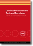
A Guide for Business Improvement
|
|


View larger image |
This guide explains how to carry out
more than twenty tools & techniques necessary to ensure your
business continually improves.
Topics covered include:
Affinity diagrams, Bar charts, Black & white
charts, Brainstorming, Cause & effect diagrams, Design of Experiments
(DoE), Failure Mode, Effect and Criticality Analysis (FMEA/FMECA),
Fault Tree Analysis (FTA), Five WHY’s for root cause analysis,
Five Ws & one H for problem definition, Flow charting, Histograms,
Pareto analysis, Pictograms, Pie charts, Plan-Do-Check-Act (PDCA)
cycle, Quality Function Deployment (QFD), Rating, Repeatability
and Reproducibility tests (R&R), Run charts, Significance testing,
Solution effect diagrams
Also includes a handy matrix showing when to apply which tool &
technique.
|
|
|
| Further reading |

|
The Memory
Jogger II: A Pocket Guide of Tools for Continuous Improvement
Michael Brassard |
|
This handy Pocket Guide uses graphics and easy-to-understand text
to describe what the tools are, why they’re used, and how
to use them. Tools are explained using real-life examples from all
types of organisations, making them easy for everyone to understand
and apply. The 22 Tools covered are
Activity Network Diagram, Affinity Diagram, Brainstorming, Cause
& Effect (Fishbone), Check Sheets, Control Charts, Data Points,
Flowchart, Force Field Analysis, Histograms, Interrelationship Digraph
(ID), Matrix Diagram, Multivoting, Pareto Chart, Prioritization
Matrices, Problem Solving Model, Process Capability, Radar Chart,
Run Chart, Scatter Diagram, Team Guidelines, Tree Diagram, Process
Decision, Program Chart, Nominal Group Technique (NGT).
|
| Buy
UK |
Buy
US |
|

top of page |
 |
